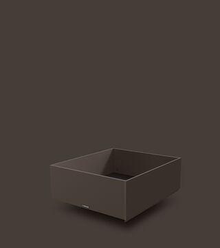
Muted Earth.

Soothing, new colourfulness.
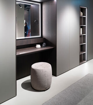
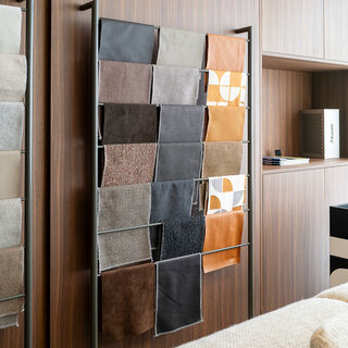
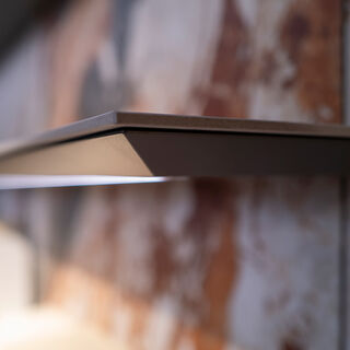
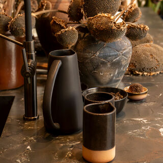
One of the most visible codes of Grounded Comfort is colour – or better: the withdrawal of colour. Anyone walking through the kitchen halls in 2026 saw a lot of beige, brown, black, and plenty of tone-in-tone. Add to this matt surfaces, natural materials, wood, earthy tones and metallic highlights that were rarely glossy, but rather appeared dull, brushed or having patina.
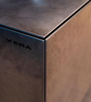
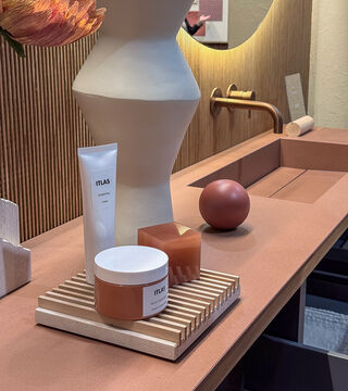
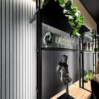
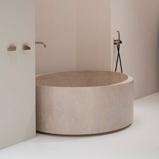
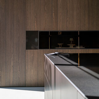
At Stosa the focus is on beige and earthy tones, complemented by fine details, protruding boxes and light-based emphases.

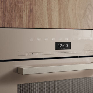
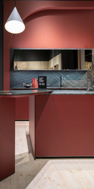
Schüller/next125 worked with calm, tone-in-tone worlds, nobilia with a green kitchen that was less of an urban colour highlight, but more a kind of new, tiled stove: a homely, familiar meeting place.
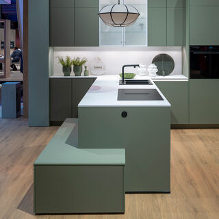
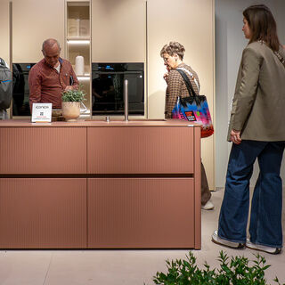
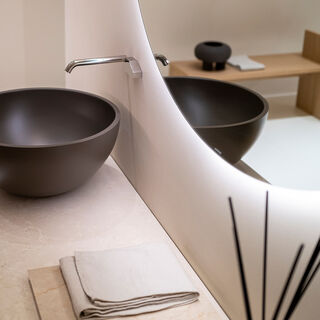

The decisive factor is: these colours don't want to stand out. They create depth, warmth, calm. Grounded Comfort doesn't need a big explosion of colour because it’s not about asserting individuality, but about creating a feeling of stability and security.

Trend report